Types of pages
When you create or edit a page, the Page Type selection offers the following:
Page categories
The page types can be grouped into three categories. The categories and details for each follow:
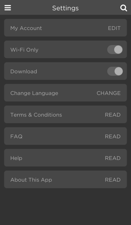
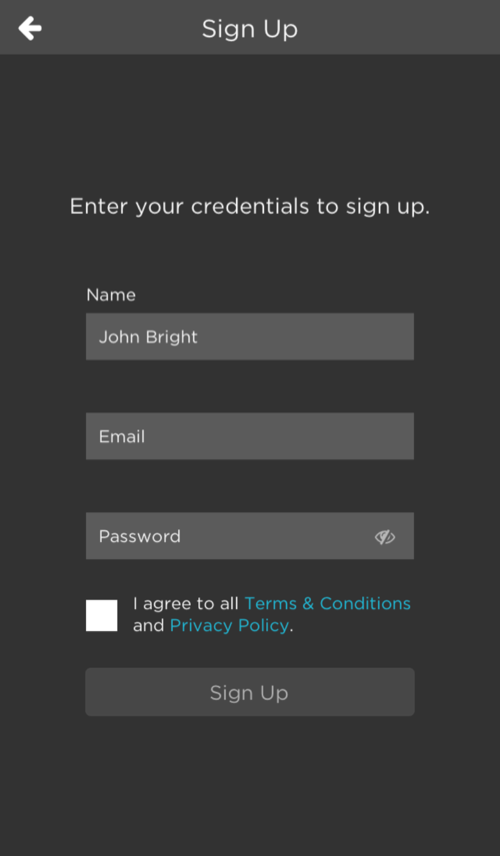
- Non-configurable
- A page you choose to include in your app, or not.
- The document Including Non-Configurable Pages provides further details, including how to add one of these types of pages to your app.
- Examples of non-configurable pages are Settings and Sign Up, shown here:
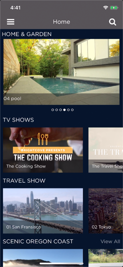
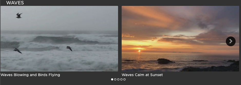
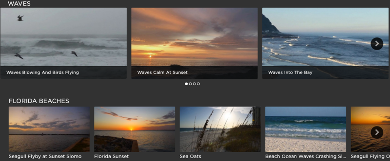
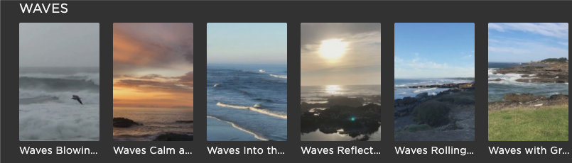
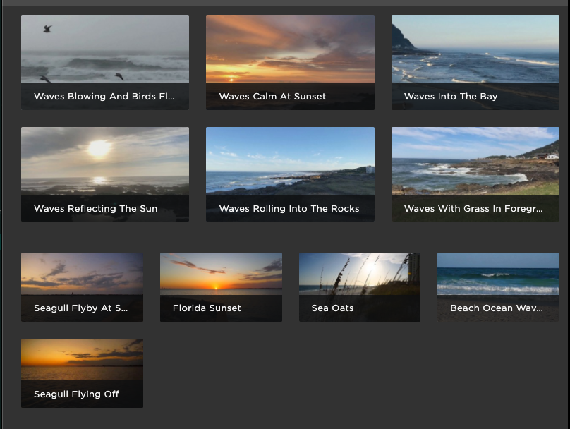
- Screen
- A page that holds your video content, in carousels, lists, etc.
- Highly configurable using blocks, layouts and playlists. Two examples on mobile platforms are show, followed by a web app example:
- screen-hero_image
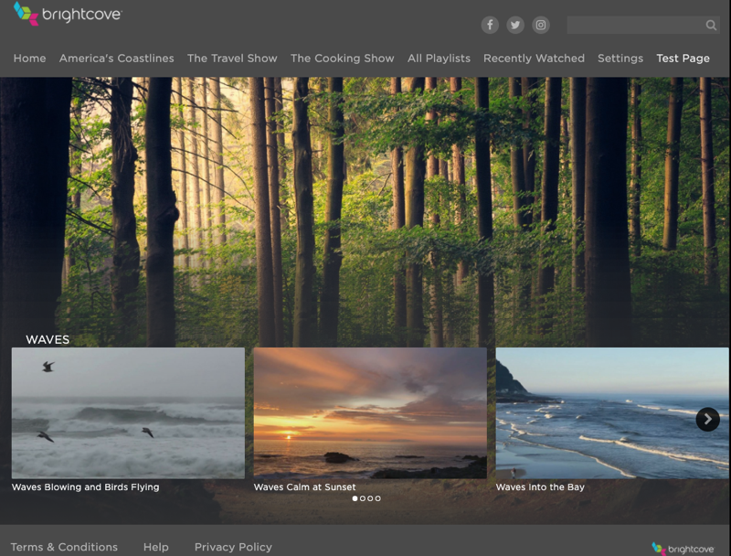
- A special type of screen page, but permits an image behind the video content.
- Need to upload both a landscape and poster orientation image for different platforms, for example, web (landscape) and mobile (portrait).
- The "hero" area at the top of the screen is meant to be non-covered and is not configurable:
- Redirect
- Redirect page types works on Web, iOS and Android Mobile apps.
- Redirect page do not work on TV apps.
redirect-blankopens a web page in a new tab.redirect-selfopens a web page in the same tab.- Specify the URL on the External Redirect tab.
Page type definitions
The following table displays the page types, including a description and its use.
| Page Type | Description | Add Blocks in the UI (Yes/No) |
Use (Required/Recommended/Optional) |
|---|---|---|---|
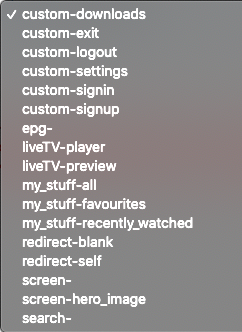
| custom-downloads | Not supported | No | N/A |
| custom-exit | Provides functionality to quit an app. | No | Required on some platforms, mainly smart TV. |
| custom-logout | Provides functionality to logout of an app. After logout, the user is left on the landing page or makes the user an anonymous user. | No | Required if you have registered users, as would be the case for most mobile platforms. |
| custom-settings | Provides access to settings. | No | Highly recommended |
| custom-signin | Provides registered user login | No | Required for registered users; not needed if you allow anonymous browsing |
| custom-signup | Provides a way for users to register | No | Required if app uses registered users; not needed if you allow anonymous browsing |
| epg- | Electronic Program Guide (EPG) displays the program guide for live TV | No | Required is app uses live channels |
| liveTV-player | Plays live video and automatically will change the orientation to landscape. | No | If you do play live TV, it is recommended to use the liveTV-preview screen, as that presents a player to the user, then on click/tap will change the orientation to landscape and play the video. |
| liveTV-preview | Plays live video with player as part of a larger page, then on click/tap will play video in landscape orientation. | No | Recommended for use over liveTV-player |
| my_stuff-all | Provides a page with two tabs, one of which displays Recently Watched and the other tab displays Favorites. This would just be a blank page with a message saying you need to use Recently Watched and Favorites. | No | Optional |
| my_stuff-favourites | Contains the videos marked by the user as a favorite. | No | Recommended |
| my_stuff-recently_watched | Contains the last 20 videos watched, chronologically listed. | No | Recommended |
| redirect-blank | Web, iOS and Android; when menu option clicked redirect occurs to a new tab. | No | Optional |
| redirect-self | Web, iOS and Android only; when menu option clicked redirect occurs to same tab. | No | Optional |
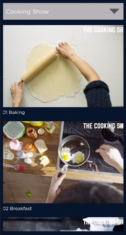
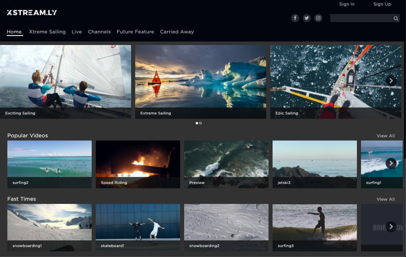
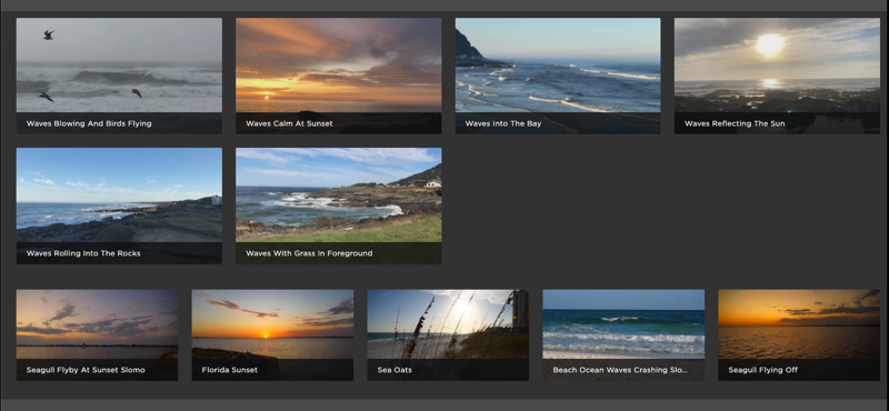
| screen- | Displays the grouped videos in carousels or tabs. Used to organize the contents of your app. | Yes | Required |
| screen-hero_image | Special type of screen page where you can add an image behind the video content. | Yes | Optional |
| search- | Provides input screen with an input field where you can search the content, and then presented the results. | No | Highly recommended |
Configuring screen pages
As mentioned earlier in this document, screen pages contain your videos and provide options for the display of the images that represent your videos. In this section, you will see your configuration options with screenshots of how those options look in your apps. You will first see information about blocks, which is the highest level of container on a screen page. Then you will see layout information, which controls how the images that represent your videos are displayed.
Blocks
Highlighted in yellow are the types of blocks you can use:
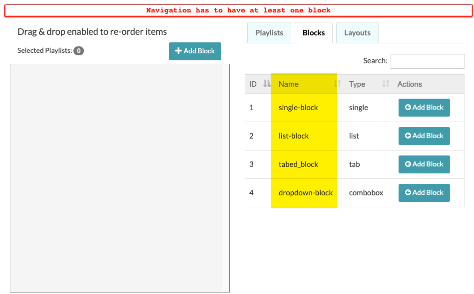
Here are images of each type:
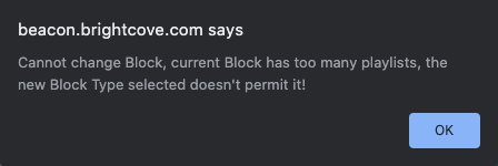
single-block
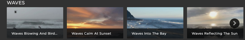
The single-block only permits you to add one layout/playlist combination to the block. The screenshot shows a single-block displaying a carousel. Note that if you try to add multiple layout/playlist combinations to a single-block, or try to change to a single-block that contains multiple layout/playlist combinations, you will get an error:
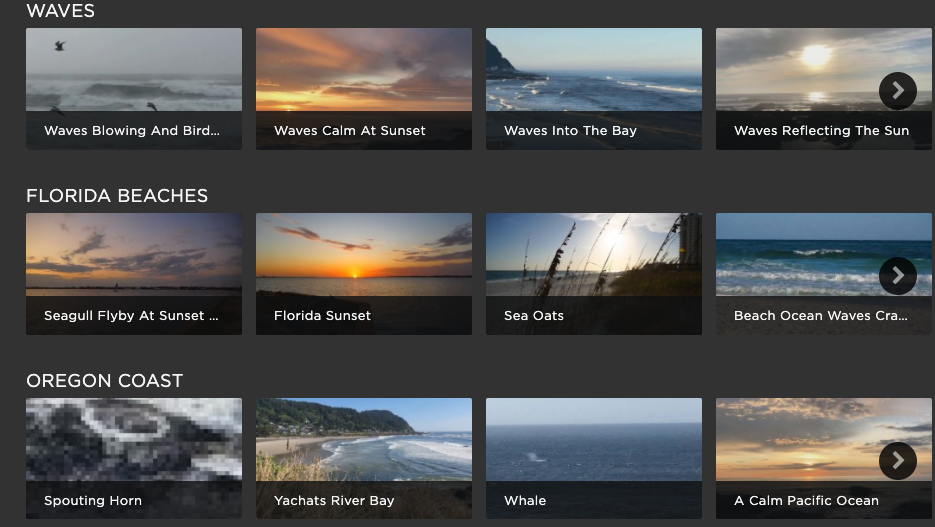
list-block
The list-block permits you to add multiple layout/playlist combinations to the block. The screenshot shows a list-block with three carousels contained therein.
tabed_block
The tabed-block permits you to add multiple layout/playlist combinations to the block, but only one will be displayed at a time and the tabs permit the user to choose which one is visible. Two restrictions do apply:
- The layouts inside a tabed-block should be the same.
- Inside a tabed-block, the layouts should be grids.
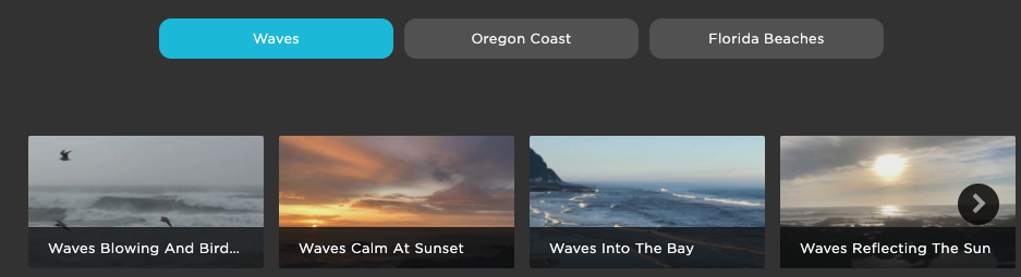
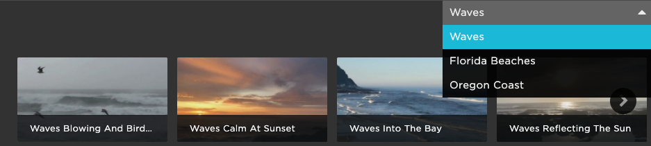
dropdown-block
The dropdown-block permits you to add multiple layout/playlist combinations to the block, but only one will be displayed at a time and the dropdown permits the user to choose which one is visible. Two restrictions do apply:
- The layouts inside a dropdown-block should be the same.
- Inside a dropdown-block, the layouts should be grids.
Layouts
In all the examples of blocks above the selected layout was a carousel. The carousel displays the image for each video in a horizontal list. That is not the only layout from which you can choose. The available layouts are highlighted in yellow:
Rather than a screenshot of each layout type, an example of each layout characteristic will be shown. They types highlighted in yellow above are combinations of different characteristics.
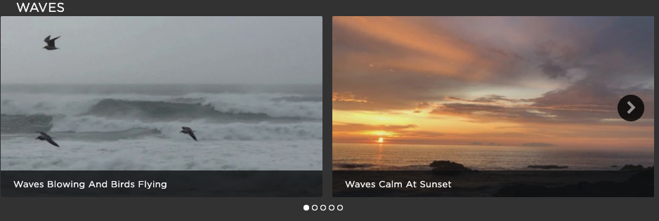
Carousel AND Labels In
The carousel displays images in a horizontal row, and the labels overlay a small bottom portion of the image.
Labels Out
Labels are below the image.
Featured
Images are larger (featured boxed in red, normal carousel below that). Often, but not always, featured layouts are used at the top of a page.
Landscape
The images are landscape proportioned.
Posters
The images are poster (portrait) proportioned.
Grid 3 AND Grid 4
The two types of grids display images in a 2-dimensional row/column pattern. The number following the grid, 3 or 4, indicates a relative size for the images. It does NOT indicated the number of columns that will always be displayed. This screenshot shows a browser at 800px wide, and the Grid 3 has two rows of three images. The Grid 4 is displaying four images across since the images are smaller.
This next screenshot is still using both a Grid 3 and Grid 4, but the browser width is 1600px. The Grid 3 images are now four across, and five images in the Grid 4 layout can fit across the screen. Again you can see the Grid 3 images are larger.
Using blocks together
The following are rules when using blocks together on the same page:
- When you have a tabbed block on a page, that must be the only block on the page.
- When you have a dropdown block on a page, that must be the only block on the page.
- The first two rules mean that a tabbed block followed by a dropdown block is not supported, and vice versa.
This concludes the options for blocks and layouts.
Common page configuration settings
In Brightcove Beacon when you are creating a new page or editing an existing page, you will see the following tabs:

The Basic Data tab is where you choose your page type, as well as configure screen pages. The other tabs are the same for all page types. The Common Configuration Settings document details the needed information on the Textual Data, Non-Textual Data, Tags and Rights & Scheduling tabs.